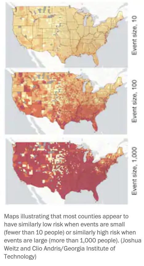
Researchers at Georgia Tech have created a real-time, interactive map to show Covid-19 risk in every county throughout all 50 states. Users can select an event size from 10+ people and click to see the risk of attending events of various sizes in different places.

For example, as of last Wednesday morning, if you were attending a Thanksgiving dinner with 10 people in Miami-Dade County, there’d be a 15% chance at least one person was COVID-19 positive, according to the tool.
But if you attended a 50-person gathering in Cook County, Illinois, there was an 82% chance at least one person was COVID-19 positive.
Reactions from experts, per The Washington Post:
“William Borden, a professor of medicine and health policy at George Washington University, called the map, which drills down to the county level, a ‘really powerful tool. It provides a really great practical way to take sort of complex data and make it understandable,’ said Borden, who was not involved in creating the tool.
Still, Borden and other experts urged people to be mindful of the data’s limitations. For instance, the Georgia Tech map doesn’t tell you your risk of actually contracting the virus at an event, Borden said.

‘That’s because your risk depends on a whole bunch of other factors, like is it outdoors or indoors? Are people wearing masks? Is there distancing? What’s the ventilation? Are people touching objects?” he said. “There are all these other factors that we have to really pay close attention to in order to reduce our risk of getting covid-19.’
Brian Garibaldi, medical director of the Biocontainment Unit at Johns Hopkins, said that the map also isn’t able to adjust for people’s unique behaviors, which may affect the risk of potential virus transmission.”

Other tools: Professors at Brown University’s Alpert Medical School released MyCovidRisk.app to estimate a person’s chances of getting the virus from specific activities and offering suggestions for reducing risk.
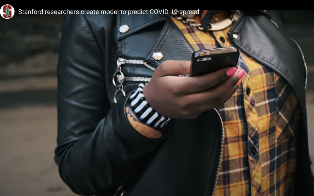
A Stanford University-led team has created a computer model using mobility data to accurately predict how Covid-19 spreads in cities and give decision makers the best possible information.
Restaurants, cafes, gyms, and “other crowded indoor places” were cited for eight out of 10 new coronavirus infections during the pandemic’s early months in a study newly published in the scientific journal “Nature.”

SafeGraph, a company that aggregates anonymized location data from mobile applications, used cell phone data to follow 98 million people in the 10 largest U.S. cities (in population order: New York, Los Angeles, Chicago, Dallas, Washington, D.C., Houston, Atlanta, Miami, Philadelphia and San Francisco) to determine where they went, how long they stayed, and what the square footage of those locations was. “Footsteps” were followed through half a million different everyday establishments: restaurants, fitness centers, pet stores, hardware stores, grocery stores, schools, churches and car dealerships.
“Restaurants were by far the riskiest places, about four times riskier than gyms and coffee shops, followed by hotels,” — Jure Leskovec, a Stanford University computer scientist, and the study’s lead author.
By cross-referencing that data with local infection rates, researchers used “standard infectious disease assumptions” to determine which venues were the most high-risk and to track how the illness spread throughout those cities.
“In principle, anyone can use this model to understand the consequences of different stay-at-home and business closure policy decisions,” said Leskovec, whose team is now working to develop the model into a user-friendly tool for policymakers and public health officials.
Read a summary of the report in Stanford News.
