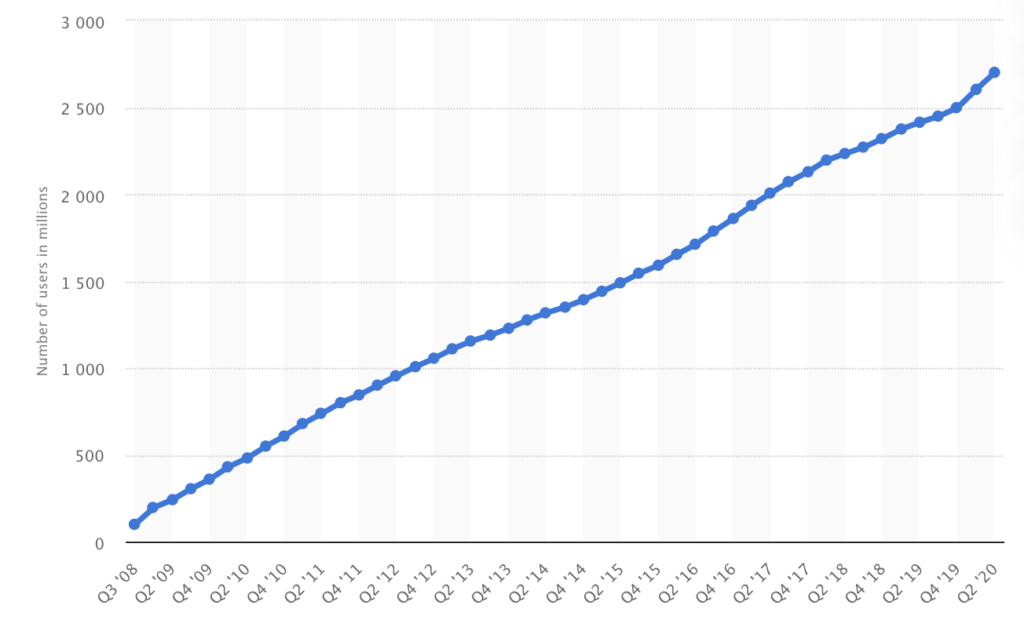
We’re used to graphs and charts that are displayed in these traditional styles. The one below, for example, represents Facebook’s monthly active users.
By the way, the number is growing toward 3 billion worldwide, a breakthrough size no social media network has yet touched.
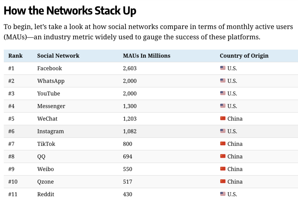
The second graphic is self-explanatory.
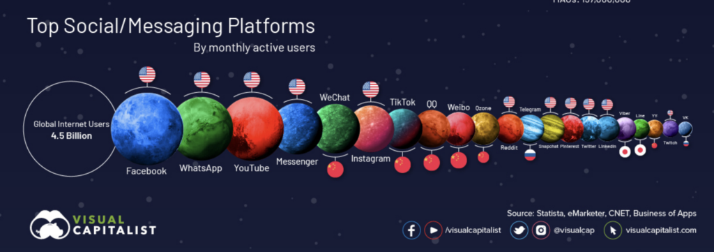
Just for fun, Visual Capitalist re-interprets things with a fresh perspective, in ways that make it easier for us.
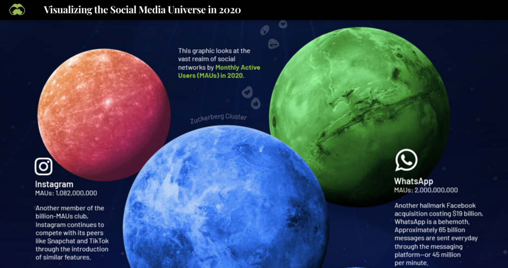
This graphic looks at the vast realm of social networks by monthly active users (MAUs) in 2020.
Related: It’s Amazing to Visualize the $$$ Difference Between a Million, Billion, and Trillion
To have a look at the that social media universe, get the whole picture here.
Leave a Reply