Red-Yellow-Green: A Chart for Calculating Risk
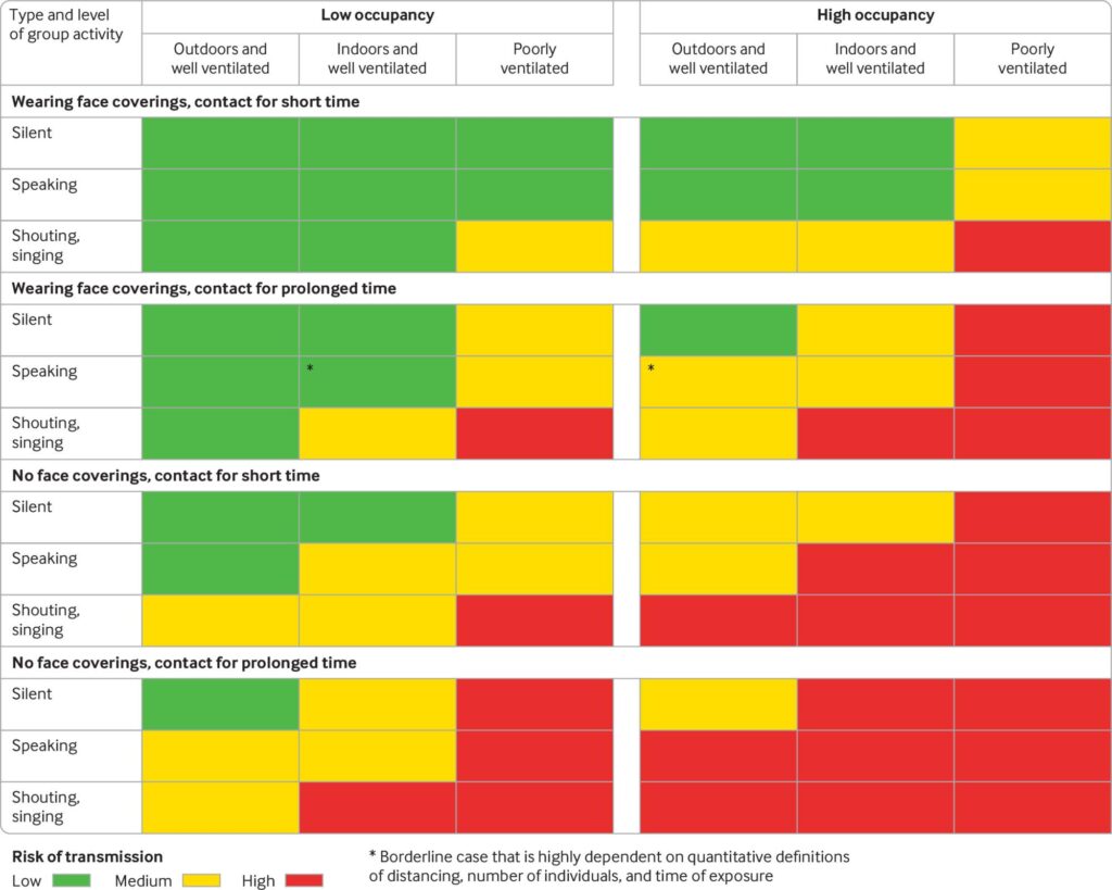
The British Medical Journal has published an article suggesting that a single, fixed physical distance rule between individuals to prevent Covid-19 transmission—six feet for instance—is outdated.
The red-yellow-green chart is based on length of time, ventilation, size of a group, and face masks, looking at susceptibility in different ways.

A team of clinical researchers, academics and medical experts propose a graded recommendation that better reflects multiple factors that combine to determine risk. This would provide greater protection in the highest risk settings but also greater freedom in lower risk settings, potentially enabling a return towards normality in some aspects of social and economic life.
Key messages:
- Current rules on safe physical distancing are based on outdated science.
- Distribution of viral particles is affected by numerous factors, including air flow.
- Evidence suggests SARS-CoV-2 may travel more than 2 meters through activities such as coughing and shouting.
- Rules on distancing should reflect the multiple factors that affect risk, including ventilation, occupancy, and exposure time.
“The grades are indicative of qualitative relative risk and do not represent a quantitative measure. Other factors not presented in these tables may also need to be taken into account when considering transmission risk, including viral load of an infected person and people’s susceptibility to infection. Coughing or sneezing, even if these are due to irritation or allergies while asymptomatic, would exacerbate risk of exposure across an indoor space, regardless of ventilation.” Read the full article here.
Over 30 Million RSVP’d to a Survey on Facebook

Data for Good is a team inside Facebook that can use the platform to reach over one billion people. A prompt posted by Carnegie Mellon University Delphi Research Center attracted more than 30 million replies and is still growing by 1.5 million replies weekly. (Facebook does not have access to the responses.)
Now, that massive pool of data is helping health researchers and machine learning academicians to identify COVID-19 hotspots earlier.
CNBC reports, “A group of epidemiologists and infectious disease experts from Carnegie Mellon; University of Maryland; Duke Margolis Center for Health Policy; and Resolve to Save Lives, a nonprofit headed up by former CDC director Tom Frieden, have launched a challenge that’s open to any data scientist or researcher.
With prize money funded by Facebook, the ultimate goal is to see if the dataset can be used to help find the next Covid-19 surge so public health officials can deploy scarce resources accordingly.” The first round deadline is Sept. 29, 2020. Read more here.
Google Maps Get an Update

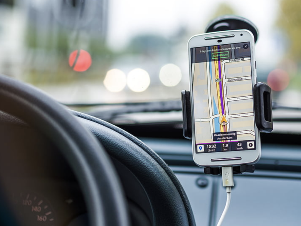
Covid-19 forced Google to change how it predicts traffic in Google Maps. Read more from CNBC.
Key Points:
- For the past 13 years, when you started a route in Google Maps, Google provided an estimated time of arrival based on years of data and intelligence from DeepMind.
- Google found global traffic dropped 50% after lock-downs started earlier this year.
- Google said it had to de-prioritize older traffic data and has changed its models to first prioritize traffic patterns from the last 2-4 weeks.
