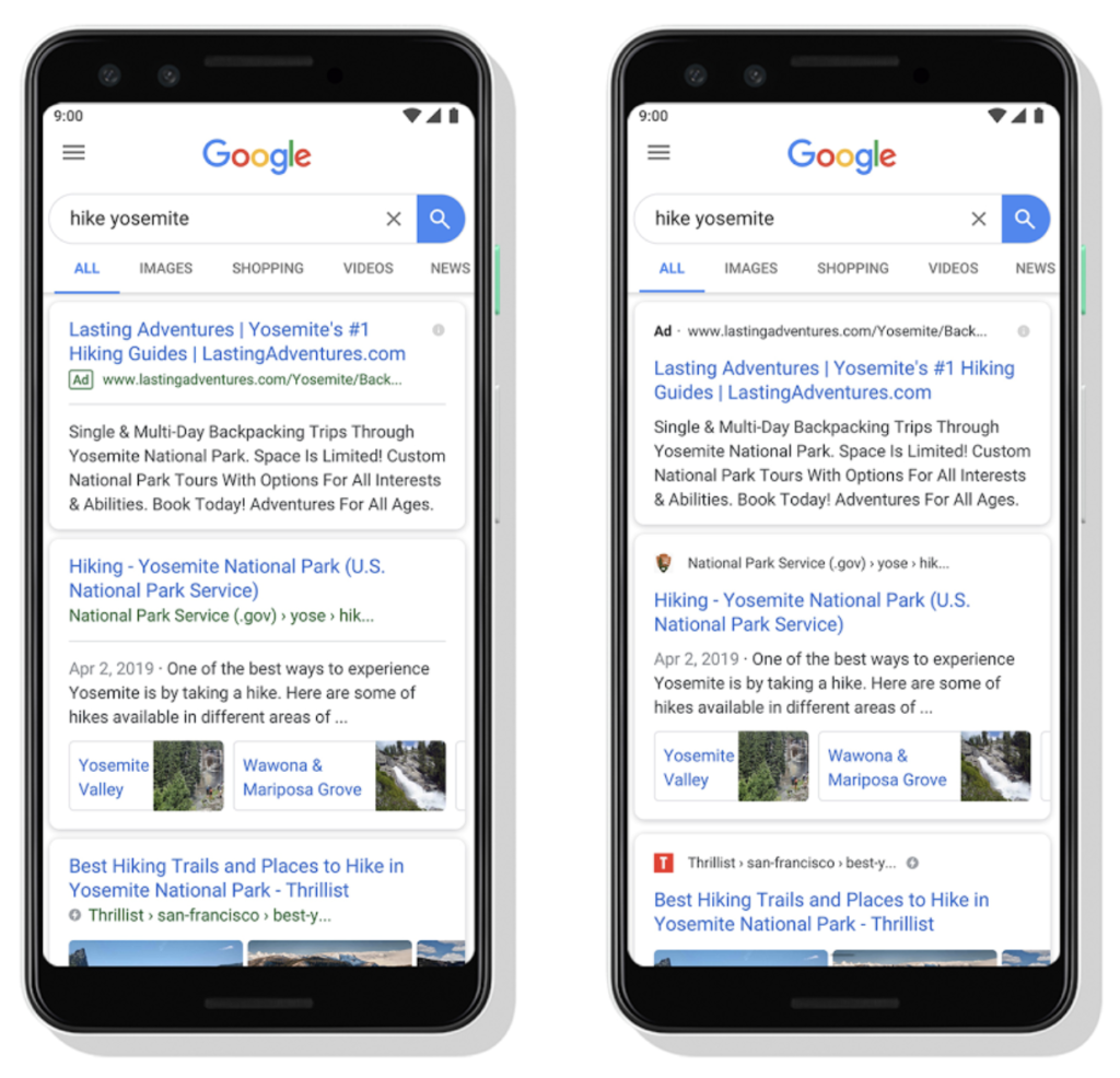
Did you notice? Google has unveiled a visual refresh of the mobile search results page.
“The name of the website and its icon appear at the top of the results card to help anchor each result, so you can more easily scan the page of results and decide what to explore next,” explains Google.
The display URL, which is crucial brand real estate, will move above the ad headline with publisher names and icons. Now being rolled out, the new look provides more prominent brand positioning. Read more from Google here (and spot Google’s blog post typo).
Related: Google Auto-Delete News, The Travel Vertical, 5/7/2019
Does your site have a favicon? Site owners can learn more about how to choose their preferred icon for organic listings here. See the new look on the right.


Leave a Reply